The main aim of brochure designs is to attract more people to a specific action, for example, the sale of a product. Firstly, the customer needs to open and read the brochures. For someone to do something like that, you should consider eight elements during the brochure designing. So here are the 8 major strategies to create a brochure that can have more audience

The 8 key brochure design elements
1. Command Attention with the Cover
A potential customer should notice the cover at first glance. It must have a neat design and consist of 3 factors: noticeable image, company logo and an interesting phrase which makes the reader know more about it. The most effective way of having a phrase is to make it less than ten words and place it on the top of the brochure with bigger fonts.
2. Attract Attention with Compelling Text
The designs can make people notice the brochures. But only the phrase on it can invite them to take it and read. There are some methods to create the phrase more interesting. One of the is to put a question on the cover and answer it within or place the starting of a phrase on the front and end it inside.

3. Set the Mood with Color
Color is a great medium to convey the mood of what you are about to say. For a business is something funny, then the use of vibrant brighter colors is the best choice. But for a serious business can use neutral hues to show their identity
4. Choose the Right Font and Font Size
Like I said about the color, the font also can create the vibe of their message. For example, a handwritten font can’t be used for a hospital. The font must be easy to read. Otherwise, all your efforts will be for nothing. Change the font size of the words or phrases according to their importance. Different sizes can also improve readability. You can learn the graphic design approaches and processes of an expert graphic design company by visiting their website alcobyte.com.
5. Use White Space Strategically
White space has an important role in the designing process. It will help the images stand out. Also leaving some white space will avoid the designs that look like clutter. The information written on them also gets enough attention.
6. Organize with Boxes
The boxes can make the people look at the content of that box. The content can be either an image or information. But use the box designs it wisely. Too many boxes can distract people from important points.
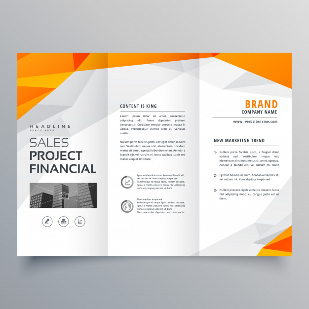
7. Choose an Appropriate Fold
There are mainly two types of folds are used: trifold and Z-fold. In trifold, the front side will have less information and the large central section can be utilized as a single page. The Z-fold designs are used when a large amount of information is needed to be presented. Each fold will contain different things from others and the brochures won’t look like clutter. In some cases, people use bifold brochures too.

8. Bring Life to the Design with Photographs
Pictures can also deliver the company’s message to its potential customers. But the person should understand the meaning easily. So choose the right images.
Final Thoughts on Creative Brochure Design Elements
Now you got an idea about simple pamphlet design. The agencies providing professional brochure design services have the power to improvise your company’s image in public.
